Logo Development Process
Below you can see the creation process of the new logo that I designed for a small coffee shop in Burlington, Vermont. This logo is a subset of the re-branding project that I was tasked to complete at my internship with HMC Advertising. See the complete project here.
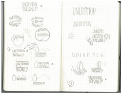 First Sketches for Uncommon Grounds |  Uncommon Final Sketch |  Initial Scan of the Final Sketch |
|---|---|---|
 The Final Sketch Vectorized |  The Final Text Sketch Scan |  Simplified Final Sketch |
 First Logo Option |  Second Logo Option | 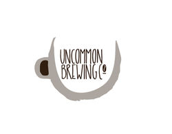 Third Logo Option |
 Final Logo |
Creative Asset Development
After I designed the logo, I was able to develop creative assets that I could present to the company. This allowed me to show the company how the logo looked in relevant, real-life uses. See below!

I created a coffee cup to show the owners of Uncommon how their logo could be adapted to all of the necessary objects.
I developed many different slogans so that there are different cup options. This gives the consumer the excitement of receiving their own company message.
I went with "Espresso Yourself" for the example in my presentation. I used my own handwriting, scanned it, vectorized it, and placed it on the cup using Photoshop.

After extensive internal and external research about coffee culture, coffee drinkers, and coffee shops, I found that people generally go to coffee shops to get a quick cup, sit and do work, or because they love the taste of that certain shop's coffee.
I sought to find Uncommon Ground's competitive advantage, which is the highly demanded taste of their coffee that they acquire from around the world, and brew in-store. Their primary business problem is that they never emphasized this advantage, so they were never chosen over their competitors. Thus, I decided to emphasize the flavor of their global beans, while also turning their business into an experience by positioning them as a brewery. The uncommon nature of a coffee brewery plays into their name, while also emphasizing the fact that they brew their own coffee in-house.
This gave me the idea of a coffee flight. It allows the "coffee connoisseur" to taste all of the coffee flavors, while the different celebrity quotes about coffee make it interesting and fun. I created this using Photoshop and Illustrator.


Finally, I created a new sign for the front of their store that has the new logo and name.
I did this by going to the shop and taking a picture of the front. I then used Photoshop to place the logo and the name on it.
This was done to give them a final idea of how effective and important it is to have a clear, meaningful logo that will hopefully bring customers in. Again, having it be a "brewery" will stop the consumer on the street and cause them to investigate further.
The fun aspects (the coffee flights, chalk boards inside, happy slogans) will help the consumer form a new perspective about the company:
"The Uncommon Brewery"